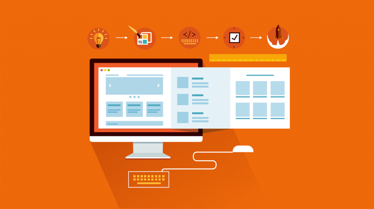
Web designing is one of the most popular career options these days. It’s a process of conceptualizing, planning, prototyping and to come up with a well thought-out structure and architecture of the website. It’s not just about defining the layout and selecting fonts and color but much more that. Today, we will have a look at some common myths of web designing.
Contents
Some Common Web Designing Myths
1. Web Designing is just the appearance of the website
There are many people who see web design as just the creation of a beautiful appearance for a site.
In reality, the design of the site is above all other things. It’s one of the important things on which user experience depends. The main purposes of the design are — to work effectively, solve problems and interact with the user. And that’s why designers have to spend hours or even days thinking about different ideas, creating mock-ups, testing prototypes and even conducting usability tests.
2. The design must be original
If you want to build everything from scratch, make sure to keep a surplus amount of time in your hand. I know it’s not possible and so there’s no sense in reinventing the wheel.
There are already many successful design practices are available on the Internet. These are well tested, easy and users are accustomed to them. If you are looking for something completely new, you need to make sure it’s appropriate and will work completely fine for different users.
It’s not like proceeding with a non-standard solution is bad but you must have ready for many brainstorming sessions and spending more time.
3. More functions mean higher satisfaction
It’s true that people appreciate a wide range of functions before using the product. But when they are on board, they want everything as simple as possible. Studies also show that a larger the number of alternative solutions, more it stimulates irritation.
The variety of functions on the website or in a program may make an interface look cluttered and difficult to understand. So, don’t force your users to think like you, just focus on simplifying the interface for better user experience.
4. Users will not scroll your website
This is one of the oldest myth related to web designing. Earlier, to scroll a page, users just had a mouse wheel where they pinch the cursor on the slider located on the side of the screen and pull, and that’ not at all convenient. But now, things have immensely changed. mouse scrolling is easier and considered as a by all users.
However, you still have to work on make your design interesting enough to motivate the user to scroll your pages. Lastly, don’t forget to ensure that important information s available before scrolling them.
5. People read everything on the Internet
If you’re an experienced web designer, you might already know about this. Nowadays, people only scan the web pages they visit. If they are able to find the required information, they will examine the page further. Otherwise, they just leave the page. In most of the cases, visitors don’t bother to understand the meaning of each word except in a case of strong interest or reading for pleasure.
So, you should focus on organizing the text, photos, and other content materials properly instead of just pouring texts. Use titles, subtitles, images, lists, quotes and don’t compromise with providing the best possible experience to users.
That’s all for this article. If you found the information useful, don’t hesitate to share it with your friends and if you know any other myth related to web designing, do let us know in the comments below.


