With the right typeface, you can convey a strong statement that resonates with your target demographic. Here, we’ll examine the fundamentals of font psychology as well as how to leverage it to your benefit when creating text. When it comes to understanding the psychological effects of font, psychologists look at how different styles and colors may evoke different emotions in readers. For instance, have a look at the following:
This is an H2 heading
It’s easy to comprehend since the font is huge and the viewer feels confident. When you see this, your mind will be able to digest it rapidly due to the huge font size of the content. You’ll get a sense of mastery and self-assurance as a result. It would seem less powerful and assured if the precise wording were in a lesser font size or just not bold. Font psychology may be used to your benefit in marketing and business in a variety of ways.
For instance, choosing bigger fonts to make your site or e-commerce business more readable may have a significant impact on conversion rates. Furthermore, the use of various colors may have a significant influence on how your material is perceived. Improved understanding and interest may be achieved, for example, by utilizing a blue hue to accent key phrases.
The Different Types of Fonts
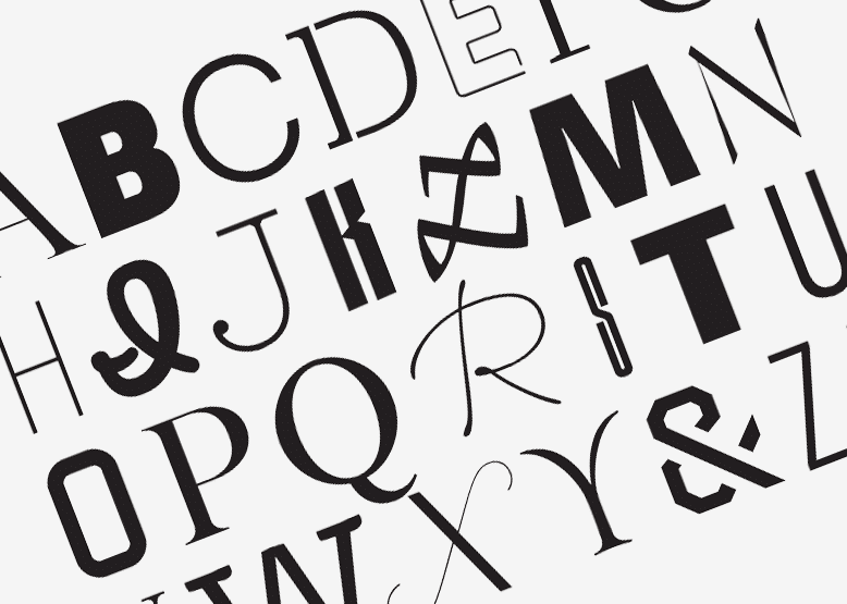
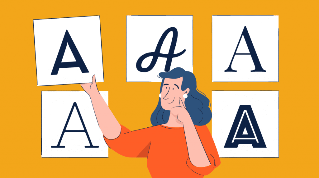
Weight, style, and family are some of the ways fonts may be grouped into categories. You can design better text layouts if you have a firm grasp of the various sorts of typefaces and how they operate. The depth of the font is referred to as weight. Headings and heavier content are often written in broader fonts, whereas the main text is typically written in thinner fonts. Font style relates to the aesthetics of the typeface’s design.
Slab serif, contemporary, script, neo-grotesque, old-style, and Beaux-Arts are the six primary styles. Each one has unique properties that may have an impact on the appearance and functionality of a typeface. The family is the kind of font creation program that was used to produce the font. More than one hundred font families are accessible, each with its own set of unique characteristics and benefits.
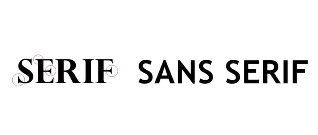
When designing text layouts, it’s important to know the many kinds of typefaces available since they may have a significant impact on how your content looks and feels. When it comes to typography, a sans-serif font will appear less formal and a monospaced font will appear crisper than a relative font. Try out a variety of typefaces to find which one best suits your writing style.


